Style-Guide Resource.
Project Title:
The Style-Guide SystemCoding Language:
HTML/CSS & JavaScriptDuration:
1 month- 06 MonthsClient:
For Easy UseAs modern websites grow in scale and complexity, maintaining consistency in visual language, UI components, and layout is crucial. A style guide acts as the central source of truth for designers and developers — ensuring all pages and features use the same:
- headings and typography,
- spacing patterns,
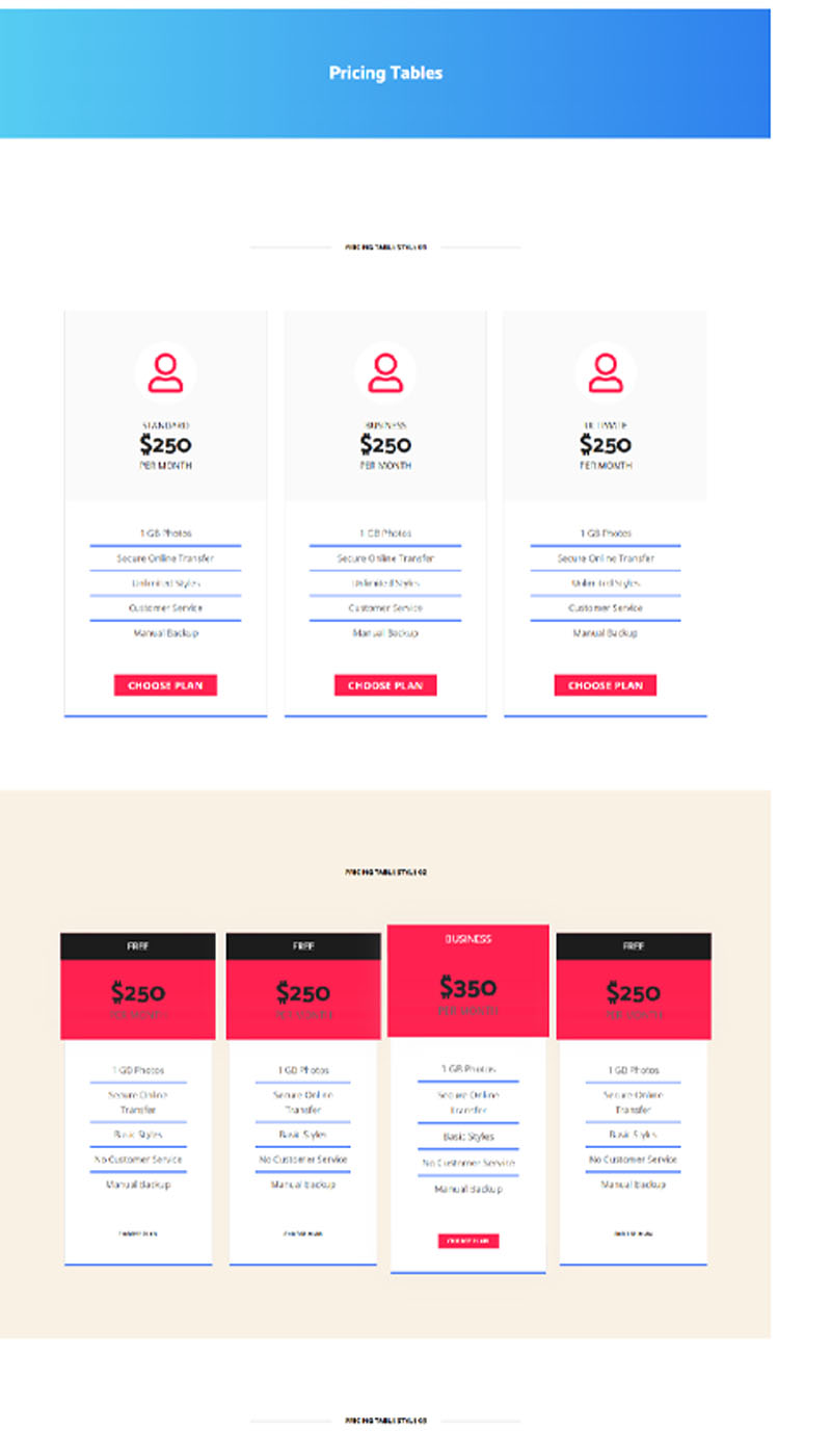
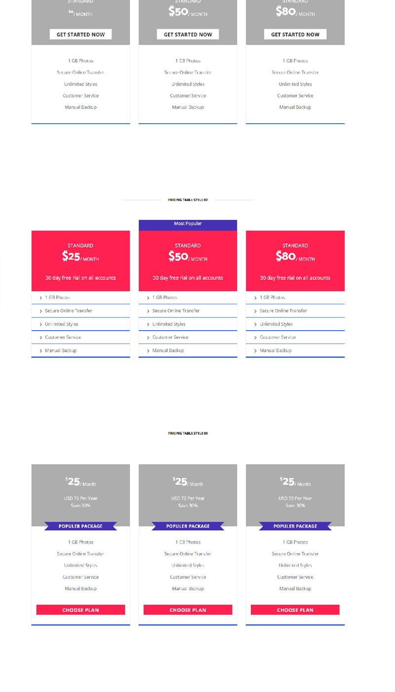
- UI blocks (like accordions, pricing tables)
- interaction elements (buttons, navigation)
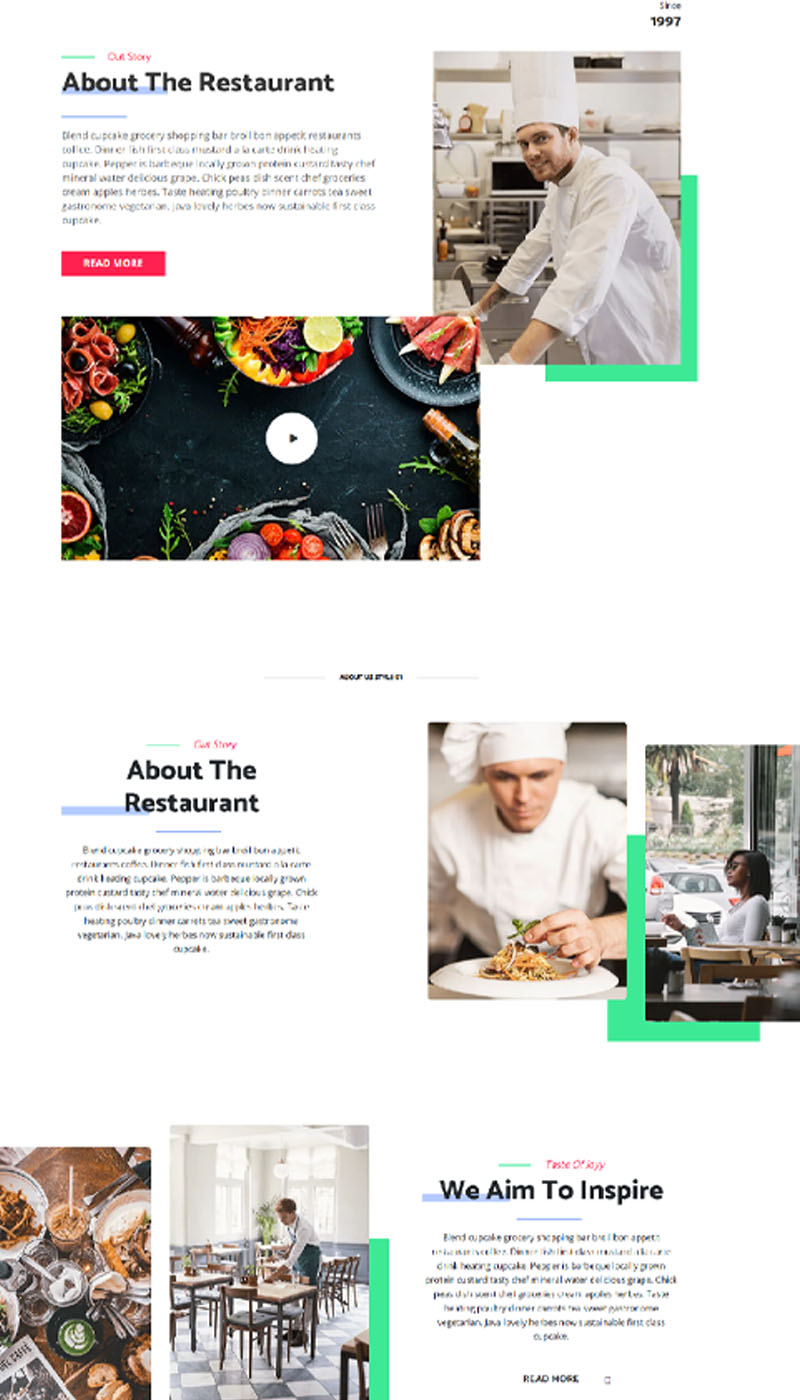
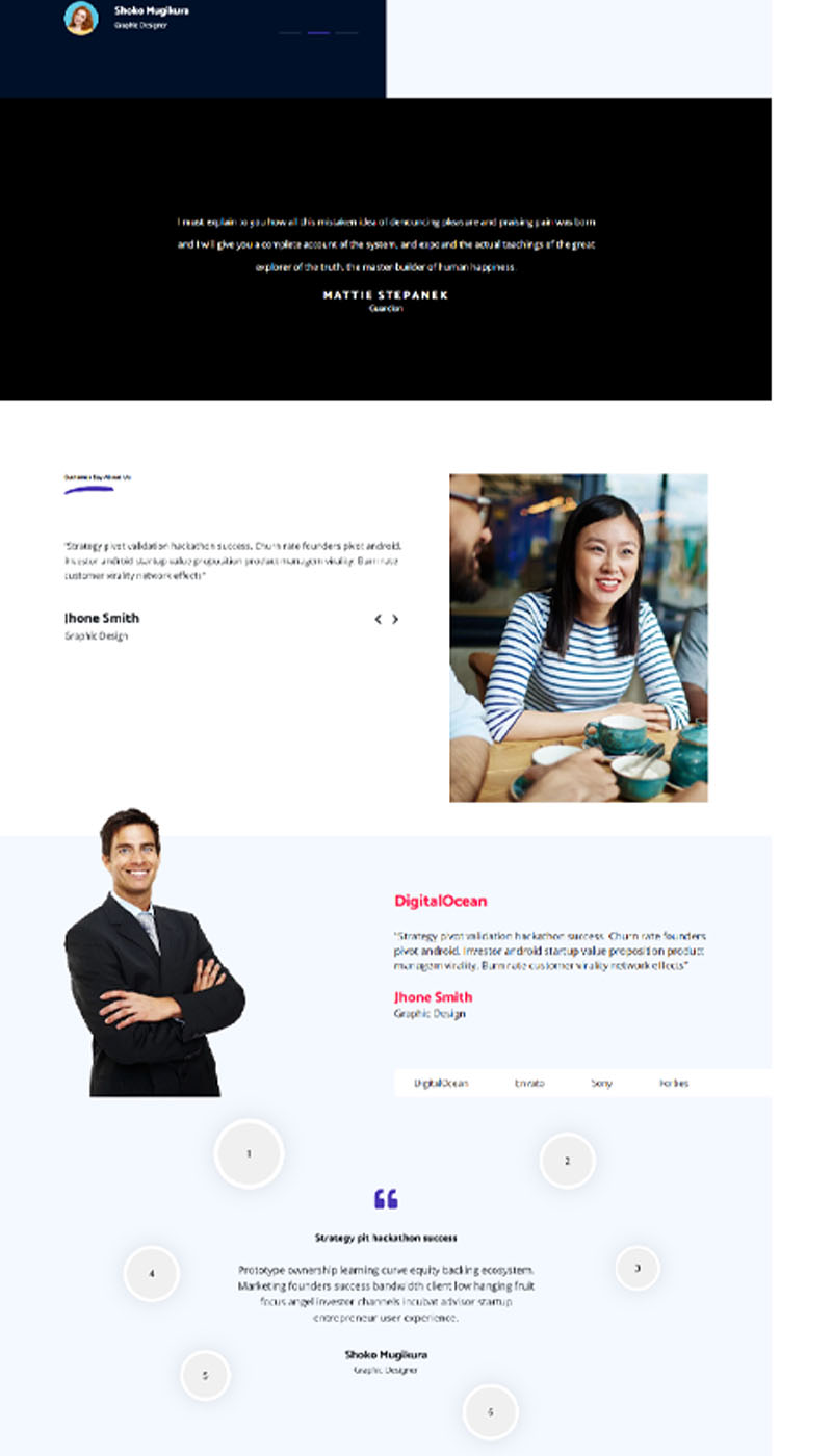
- and common modules (testimonials, galleries).
This style guide page serves as both a documentation resource and a reference living library of all essential design elements used across site templates or projects.
Design Goals
- Create a unified visual language that feels coherent and professional across all pages
- Break down the interface into modular elements (buttons, banners, headers) that can be reused across different site layouts.
- Future features and pages should be able to adopt these predefined styles without ambiguity.
- Clearly document styles so that designers, developers, and content editors can implement them with minimal guesswork.
The scope of the Multi project covThis aligns with best practice guidance on style guides — where the primary aim is to standardize visual and structural conventions so work becomes more efficient and user experiences more coherent.
🛠 Design System Benefits
- Standardizing shapes, colours, typography, and spacing ensures that users receive a uniform experience throughout the site.
- Developers can reuse patterns instead of rebuilding them from scratch. Designers don’t need to redesign common elements repeatedly. This can reduce development hours and redesign cycles.
- A solid guide becomes the backbone of future design updates, including responsive behaviour and new page creation.
- While the page itself doesn’t show accessibility features, well-constructed style guides typically include conventions for accessible typography, colour contrast, and interaction patterns. (This is best practice in the field.)
Design & Implementation Process (Hypothetical)
Although the style guide page itself does not explicitly document the design workflow, the structure and completeness of the system suggest a methodical, industry-standard process behind its creation. The project likely began with a discovery and audit phase, where existing pages and layouts were reviewed to identify visual inconsistencies, repeated UI patterns, and commonly used components. This initial analysis helps uncover gaps in consistency and defines which elements need to be standardised across the site.
Following this, the focus would shift to defining the design foundations. Core visual principles such as typography hierarchy, grid systems, colour palette, spacing units, and iconography are established at this stage. These foundational decisions form the backbone of the entire design system, ensuring every component aligns with a consistent visual language and brand identity.With the foundations in place, the next step involves building modular components. Reusable UI elements—such as cards, banners, accordions, navigation menus, form elements, and content blocks—are designed as independent modules. This modular approach allows components to be easily reused across different pages while maintaining flexibility and scalability.Once components are created, usage rules and documentation are defined. Each element is presented with clear examples and guidelines explaining when and how it should be used. This step is essential for maintaining consistency, especially when multiple designers, developers, or content editors are working on the project.
Finally, the system undergoes review and iteration. Components are tested across different screen sizes and devices to ensure responsiveness, usability, and visual consistency. Feedback and real-world use inform refinements, allowing the style guide to evolve as a living system rather than a static document.This structured workflow reflects established best practices commonly used in professional design system and style-guide development projects.
